Before after comparison
Image comparison with a draggable divider, driven by a native range input — so it also works with arrow keys and is announced properly to assistive technology. Up to three comparisons.
- Merchant-addable
- Yes
- Settings
- 36
- Block types
- 1
- Max blocks
- 3
- File
sections/before-after.liquid
Used by default on: Home, Product
When to use it
Visible, honest transformations — texture, finish, fit, coverage.
Setting it up
- Add the section and write the heading and intro under Section content.
- Pick a Layout and set Comparison behavior — drag, hover, or reveal.
- For Carousel, choose Content layout → Beside comparison to place the existing eyebrow, heading, and subheading to the left on desktop, centered on the image. Content stacks above below 990px. Above comparison is the default; Grid and Editorial always keep the introduction above.
- Optionally enter a Button label and Button link under Section content. The button appears only when both are filled, in either content layout.
- Set Content alignment for desktop and Mobile header alignment for screens below 750px. Both default to Center. Choose Follow desktop to reuse Content alignment on mobile. Heading size scales the subheading too.
- Add a Comparison block per pairing, with a before image, an after image, and captions.
- On the product template, set Comparison source → Product comparisons to show each product's own pairing instead. Create the
custom.before_imagesandcustom.after_imagesproduct metafields as lists of images (optionallycustom.comparison_captionsas a list of single line text), then fill both lists on each product in the same order. See Show each product's own comparison. - On the home page or other non-product pages, choose a Product in each Comparison block so shoppers know what they are looking at. A small linked product, with thumbnail, title, and price, appears below the comparison. Choosing a product hides Caption link; the product carries the link instead. The product link never appears on product pages.
- Match the two images exactly for framing, lighting, and crop. A comparison where the lighting changed is not a comparison.
Where the content comes from
Section settings own the introduction, content layout, and optional button. Comparison blocks own images, labels, captions, the product shown, links, and ordering by default. Optional product metafields supply paired comparison images and captions in Product comparisons mode; manual blocks work without metafields.
Notes and cautions
- Editorial centers the comparisons as a group on desktop, with a larger lead image and bottom-aligned supporting images. Every image ends on the same line and labels sit below each image, so captions and products line up across the row. Extra width stays at the outer sides, keeping the gap between blocks consistent. On mobile, two comparisons share a 60/40 row; three show a full-width lead above an equal pair.
- Before-and-after imagery invites overstated claims and is heavily scrutinized in regulated categories. Keep the pairings honest and the captions factual.
- The divider is keyboard-operable, which most comparison sliders are not. Do not replace it with a mouse-only widget.
Place content beside a comparison
New sections start with a Carousel, Wide images, Above comparison content, a Medium heading, centered Content alignment and Mobile header alignment, and Reveal on scroll interaction. The default introduction is “Texture study”, “See how the finish changes”, and “Use the reveal to compare product texture and finish under consistent lighting.”
The preset includes two manual comparisons: Balm / Melted texture and Bare finish / Mineral SPF finish, with their explanatory captions and no product links or selected images. Placeholders let the preset work before images are chosen. Starter captions describe how to use the comparisons without naming a demo product. Existing demo instances retain their saved product-specific captions.
Other saved defaults are two product comparisons when using Product comparisons, two mobile columns when using Grid, horizontal divider orientation, a 50% starting position, visible labels, a Bar handle, a 1px divider, Scheme 6, entrance animation enabled, and 60px top and bottom padding. Images use the theme corner radius; the optional custom radius starts at 12px. The optional button and product picker start empty. Existing section instances keep their saved values.
Choose Layout → Carousel, then set Content layout → Beside comparison. At desktop widths of 990px and above, the introduction sits on the left and the comparison sits on the right. The introduction is centered on the image itself, not on the labels, captions, and carousel controls beneath it, so its midpoint always meets the image’s midpoint at every image ratio. Below 990px, content appears above the images in the same reading order.
The section offers three layouts: Grid, Carousel, and Editorial. A Stacked layout, one full-width comparison above the next, was removed: Carousel shows a single large comparison at a time without the very tall section that stacking produced.
The panel reuses Eyebrow, Heading, and Subheading under Section content. It does not repeat the introduction above the section. Content alignment controls the text alignment in either position on desktop, and aligns comparison labels and captions on every screen size. Choose Left for a conventional side panel or Center to center all comparison text. Labels beneath narrow images align within their respective half of the card. Mobile header alignment controls the introduction and its button below 750px. Choose Left, Center (the default), or Right independently, or use Follow desktop to reuse Content alignment. This mobile override applies only to the introduction and its button; comparison labels and captions continue to follow Content alignment. There is no separate Caption alignment control.
Heading size uses the theme’s compact scale: Small is 22px, Medium is 28px, and Large is 36px on desktop, reducing to 20px, 24px, and 28px below 750px. The same setting also scales the subheading. Small uses 14px supporting text on desktop and 15px on mobile, Medium uses 15px, and Large uses 16px. This keeps the body text subordinate to the heading while maintaining readable mobile text.
| Setting | Behavior |
|---|---|
| Content layout: Above comparison | Default. Keeps the introduction above the comparison. |
| Content layout: Beside comparison | Available for Carousel. Uses two columns on desktop, with the introduction centered on the image, and stacks on smaller screens. |
| Button label | Optional action text, such as “View product”. Leave blank to omit the button. |
| Button link | Appears when a button label is entered. Both label and link are required for the button to render. |
Grid and Editorial retain the introduction above the comparisons. Switching to either layout ignores a previously saved Beside comparison selection. Clearing all introduction text and the button removes the content panel and lets the comparisons use the section width.
Editorial comparisons form a centered group with a larger lead image. Extra desktop width stays at the outside edges, preserving the gap between comparisons. Every image in the row ends on the same line, whether or not a comparison has a caption or a product, and captions start together beneath them.
In Grid and Editorial, comparisons in the same row share a caption row: captions start at the same height, and product links line up along the bottom of that row even when one caption wraps further than another.
Wide images retain their 16:9 ratio in the Carousel layout and are capped at 480px tall (approximately 853px wide). The comparisons stay centered with space at the sides on wider screens, keeping captions and navigation close to the image.
Carousel navigation uses an unboxed row of small arrows and pagination marks beneath the image. The active comparison has a short line indicator. Arrow buttons retain 44px tap targets, and keyboard focus remains visible.
Reveal on scroll makes one sweep using the global interface animation speed and easing. No motion and reduced-motion preferences disable the sweep and smooth carousel scrolling. Dragging and keyboard input interrupt the sweep immediately. Comparison sliders have unique labels that identify their Before and After pairings.
On touch screens the divider moves only when the shopper grabs the handle, and it follows the finger from where it was grabbed instead of jumping under it. A tap anywhere else on the image changes nothing, and a swipe there behaves like any other image: sideways it moves to the next comparison in a Carousel, up or down it scrolls the page. A Carousel swipe follows the finger like a photo carousel, keeps the page still while it moves sideways, and lands on exactly one comparison per swipe, so even a hard flick never skips past the next one. A swipe past the first or last comparison stops at the edge rather than triggering the browser’s back gesture. With a mouse, clicking or dragging anywhere on the image still moves the divider, since there is no swipe to protect.
Name the product in each comparison
Home page and other non-product pages only. The product link never appears on a product page, even when a Comparison block has a product selected.
On the home page or any other non-product page, a shopper cannot tell which product a comparison shows unless you say so. Choose a Product in a Comparison block to add a compact product link below that comparison: a small thumbnail, the product title, and its price, linked to the product page. Its place directly under the comparison identifies it, so there is no visible label; screen readers announce it as “Product shown” followed by the title and price. Sale prices show the compare-at price struck through, products with several prices show “From”, and unit prices appear when the variant has one.
| Setting | Behavior |
|---|---|
| Product | Optional. Shows the product below the comparison, under the caption, aligned with Content alignment. Not shown on product pages. |
| Caption | Optional plain text above the product, such as the treatment or timeframe. |
| Caption link | Appears only when no product is selected. Turns the caption into a link, for example to a collection or a page. |
Selecting a product hides Caption link and leaves the caption as plain text, so each comparison has one link. Clearing the product brings the caption link back with its saved value. The product link is a 44px tap target that never grows wider than its comparison.
The product link is sized by the comparison it sits under, not by the screen:
| Comparison width | Product link |
|---|---|
| 440px and wider (Carousel and Editorial lead images on desktop) | Large: 44px thumbnail and a 16px title, one step above Standard. |
| 260 to 440px (Grid cards, portrait frames, single-column mobile) | Standard: 40px thumbnail and a 15px title. |
| Under 260px (two-column mobile Grid, Editorial supporting images on mobile) | Compact: title and price only, stacked, with no thumbnail or arrow. |
The thumbnail’s corners always follow the product link’s outer border. Both come from the theme’s block corner radius, and the thumbnail’s radius is reduced by the space between the two edges, so the curves stay parallel. With a fully rounded (pill) corner setting the thumbnail becomes a circle; with square corners both are square. Product images are cropped to fill the thumbnail, so tall packshots do not stretch the link. The thumbnail stays square; when a long title wraps to a second line, it stays centered beside the text. A unit price shares the price line.
On a product page the shopper is already looking at a product, and a second one under the comparison would compete with it, so the product link is left out there. This applies to every product template and to both comparison sources. In the theme editor, a product page that has a product selected in a Comparison block shows a note explaining why it is missing. Products chosen there are kept, so the same section still shows them if it is used on another page. On product pages, the caption stays as plain text. The preset ships with the Product setting empty, because a starting comparison cannot rely on a product that exists in every store.
Captions wrap long unbroken text and use 15px text, including on mobile. Images use width hints capped to the comparison frame; first-section comparison images load eagerly with high fetch priority, while later sections load lazily. In a Carousel, the next comparison’s images start loading once the visible one has finished, so a swipe lands on a ready image; this stops one slide ahead and is skipped when the shopper’s browser asks to save data. The section’s stylesheet and script load only when it renders, so a product page where it hides costs no extra requests.
When Show labels is enabled, cards up to 360px wide place Before and After labels in separate columns below the image. Longer labels wrap without overlapping or covering the divider. Wider cards retain image overlays, with each label limited to half the image width. Editorial always places labels below the image, on the lead too, so comparisons of different widths in the same row keep their images aligned.
Section settings own the introduction, layout, and button. Comparison blocks own manually
selected images, labels, captions, the product shown, links, and ordering. They can be duplicated or reordered;
the first comparison remains the lead in Editorial. Product comparisons can instead use the
optional custom.before_images, custom.after_images, and custom.comparison_captions
product metafields. Manual comparisons require no metafields.
Show each product’s own comparison
On the product template, one Before after comparison section can show a different pairing on every product. Instead of Comparison blocks, it reads two image lists saved on the product itself and pairs them in order. The default product template already uses this mode, so once the two lists exist and a product has images in both, the comparison appears on that product’s page. Products without images skip the section entirely.
This setup is optional. Comparison blocks keep working without any of it.
1. Create the two image lists
- In Shopify admin, go to Settings → Custom data → Products and choose Add definition.
- Enter
before_imagesas the Name. The line beneath the field must read exactlycustom.before_images; the section looks for that identifier and nothing else. - Under Type, choose List, then Image from the File group.
- Check that the definition is pinned (the button at the top right reads Definition pinned), so the field appears on every product page in admin, then choose Save.
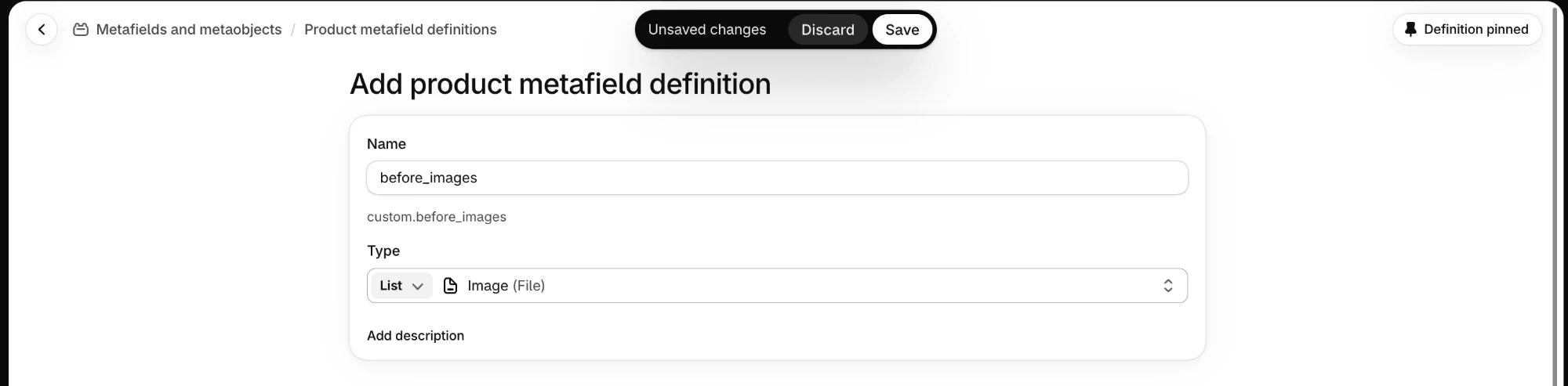
Repeat the same steps with the name after_images, which creates custom.after_images.
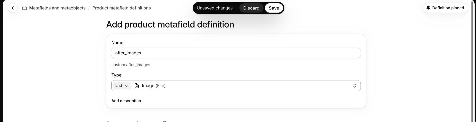
To add a caption under each comparison, create a third definition named comparison_captions
(custom.comparison_captions) with the type List of Single line text. Captions are optional;
a comparison without one shows the images and labels only.
2. Add images to a product
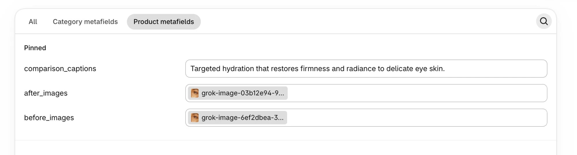
Open a product in Shopify admin and scroll to the Product metafields card. Both lists now
appear there. Choose Select images beside before_images and pick the photo taken before use.
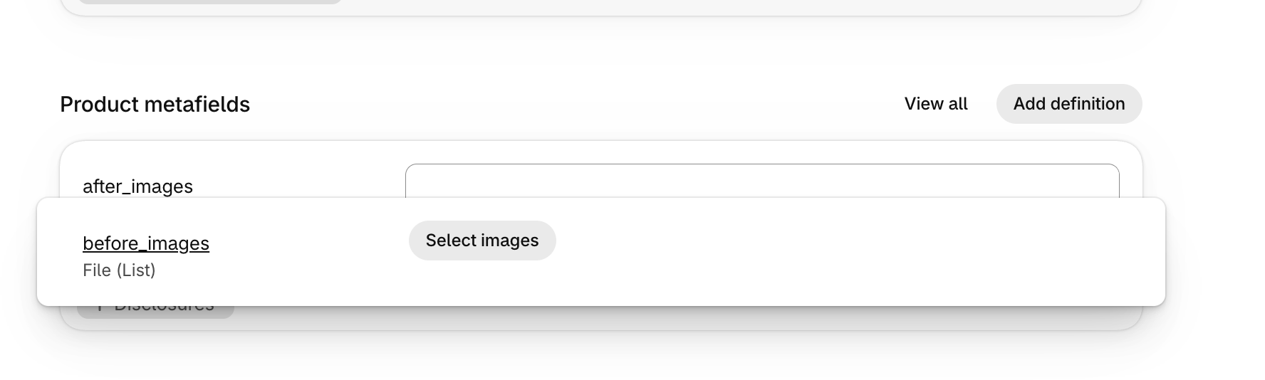
Do the same for after_images, choosing the photo taken after use, and save the product.
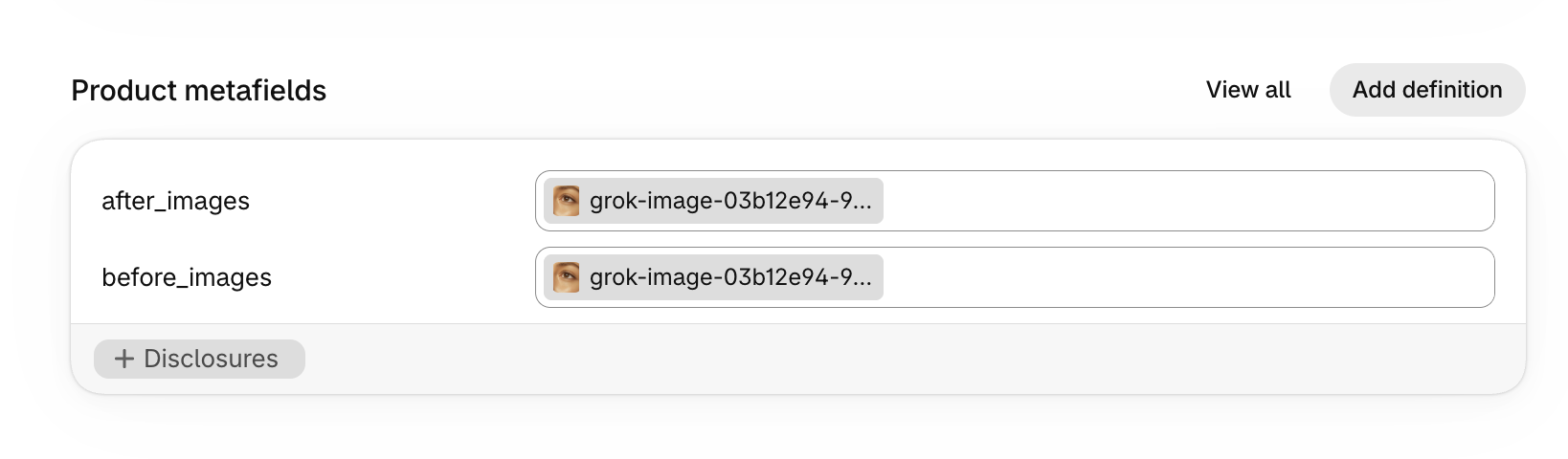
Images are paired by position: the first before image pairs with the first after image, the second with the second, and so on. Add images to both lists in the same order and keep the two lists the same length. Removing an image from one list shifts every pair after it, so the section would compare the wrong photos. Up to three pairs show.
If you created the captions list, enter one caption per comparison in the same order. Here the product has one pair and one caption.
For an honest comparison, take both photos with the same framing, lighting, and crop. Use the same aspect ratio for both, so the divider lines up across the two images.
3. Check the section in the theme editor
Open Online Store → Themes → Customize, switch to the Default product template, and preview the product you just filled in. In the Before after comparison section:
| Setting | Behavior |
|---|---|
| Comparison source: Product comparisons | Reads custom.before_images and custom.after_images from the product being viewed. Comparison blocks are ignored in this mode. The default product template already uses it. |
| Comparisons shown | The most pairs to show from the lists, from 1 to 3, in list order. |
| Product | Used only when the section is placed outside a product page, to choose whose images to show. On product pages the current product supplies them. |
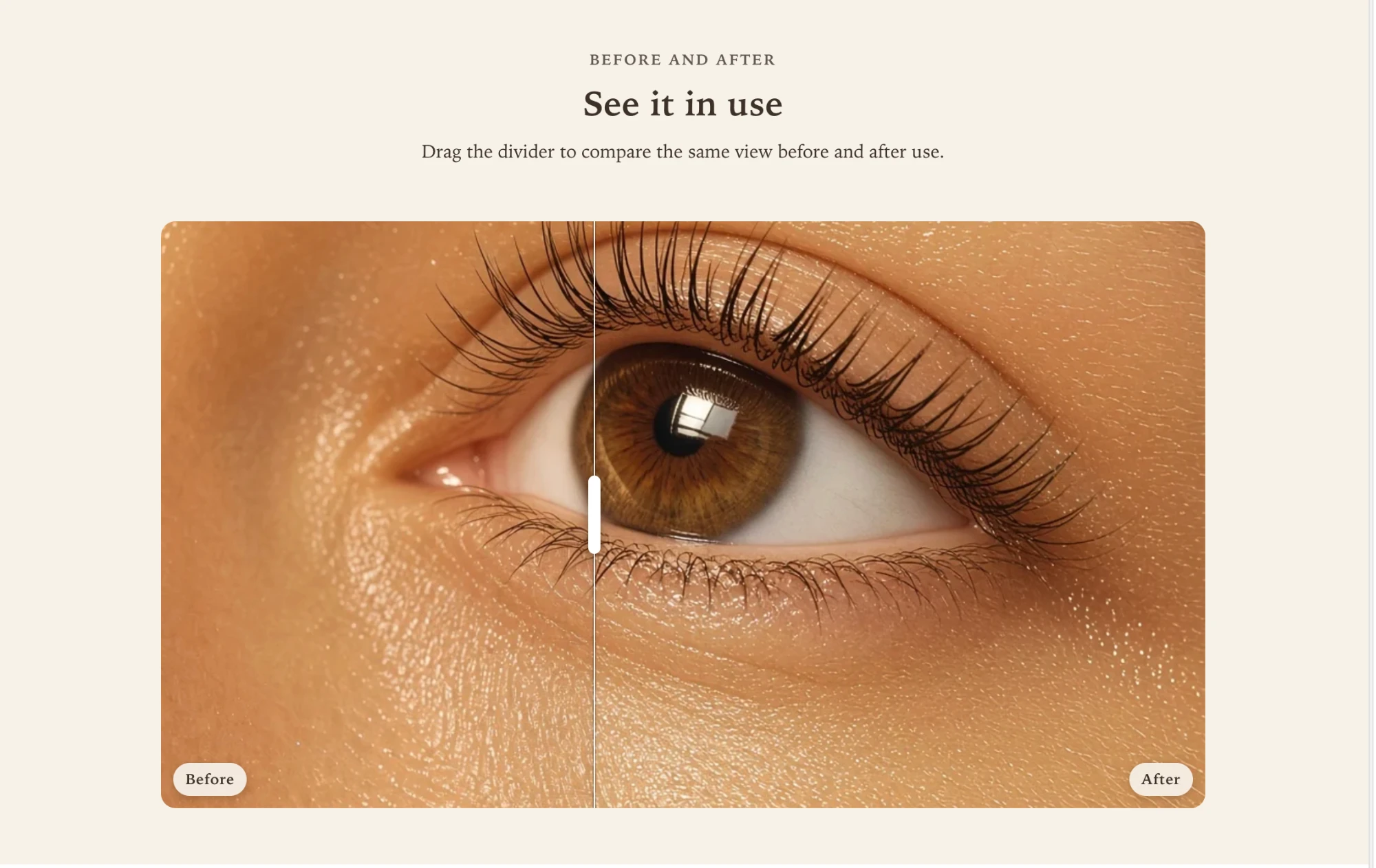
The product page now shows that product’s pair, with your section heading above it and the Before and After labels on the image.
When the comparison does not appear
- The product has no images in one of the lists. A comparison needs both a before and an after image at the same position. On the live store, a product with no complete pair hides the section rather than showing placeholder images. In the theme editor, the section stays visible with a note that it is waiting for images.
- The lists have different lengths, or more than three pairs. The theme editor shows a note with how many before and after images it found and how many comparisons it shows. Extra images at the end of the longer list are left out.
- The identifier is different. A definition named “Before photos” creates
custom.before_photos, which the section does not read. Edit the definition’s name, or create a new one, so the identifier readscustom.before_imagesorcustom.after_imagesexactly. - Comparison source is still Comparison blocks. That mode shows the same blocks on every product and ignores the product’s images.
Manual before and after image slots use the standard image icon until you choose each image. The associated Shopify product card retains its product placeholder.
Section settings
Every setting on the section itself, in the order it appears in the theme editor. Group headings match the editor's own grouping.
Section content
Aligns the introduction and its button below 750px, separately from Content alignment.
Comparisons
Comparison blocks show the same pairing on every page. Product comparisons read each product's own images and hide the section on products that have none.
Product comparisons read the product metafields custom.before_images and custom.after_images, and pair them in order. Keep both lists the same length and in the same order, because removing an image from one list shifts every pair after it and compares the wrong images. Up to three pairs render. Captions can come from custom.comparison_captions. This mode skips Comparison blocks.
The most pairs to render from the lists, in list order.
Applies outside a product page. On product pages, the current product supplies the comparisons.
Layout
Beside comparison places content on the left on desktop, centered on the image, and above it on mobile.
Comparison behavior
Drag lets shoppers move the handle. Hover follows the cursor on desktop. Reveal plays a short automatic sweep the first time the comparison scrolls into view.
Where the divider rests before the shopper moves it.
Style
Fades the section in on scroll. Respects the theme animation setting and reduced motion.
Section padding
Blocks
Blocks are added, reordered, duplicated, and removed inside the section. Each type has its own settings.
Comparison comparison
For the clearest result, use two images with the same dimensions and framing. 1200 x 1200px .jpg recommended.
Shows the product used in this comparison below it, linked to the product page. Appears on the home page and other non-product pages only. Product pages never show it. Replaces the caption link.
Optional line shown below the comparison, such as the treatment or timeframe.