Featured collection
Products from one Shopify collection, shown as a shelf, a grid, or an editorial spotlight. Mobile has its own layout, and the cards share the theme’s global product card and variant settings.
- Merchant-addable
- Yes
- Settings
- 23
- Block types
- —
- File
sections/featured-collection.liquid
Used by default on: 404, Home
When to use it
Home pages and landing pages where customers should browse a curated collection and start a purchase. Use the collection page for the full catalog, filtering, and sorting.
Setting it up
- Add Featured collection to the template and choose Collection under Content. Products follow the selected collection’s order; there are no product blocks to add.
- Write Eyebrow text, Heading, and Body text. Clear Heading to use the collection title. Set Button label for the collection link, or leave it blank to hide the link.
- Choose Desktop layout: Product shelf for horizontal browsing, Grid for rows, or Editorial spotlight to give the first product more space.
- Set Products to show from 2 to 12, Desktop columns from 2 to 5, and Space between products. The default shelf shows up to seven products with four cards across on desktop.
- Set Mobile layout independently to Swipe or Grid, then choose One or Two under Mobile products per row. Preview both desktop and phone widths.
- Under Product cards, choose Quiet or Framed, decide whether to show product numbers, and turn Show quick add on if customers should purchase from the cards.
- With quick add enabled, choose Button visibility and whether to enable Show quick view for products that need option or selling-plan selection. Choose options opens a compact purchase popup with variants, quantity, and Add to cart.
- Review Theme settings for card images, hover behavior, vendor, ratings, and badges. Enable Show in featured collections under Product cards; configure picker appearance under Product variants and the popup under Quick view.
- Finish with Color scheme, Heading size, Content alignment, and spacing under Style. Heading size also controls the product card text size in this section.
Where the content comes from
Shopify owns collection membership and order, product titles, media, prices, variants, and availability. The section owns editorial copy, layouts, framing, product numbers, and purchase controls. Global theme settings own shared card presentation and variant pickers; a reviews app supplies rating data.
Notes and cautions
- No collection selected shows up to six placeholder cards. A selected collection with no products shows an empty message instead. Choose a populated collection before publishing.
- Show collection product count reports the whole collection, not just the products displayed by this section.
- Editorial spotlight enlarges the first product on desktop. Put the intended lead product first in the collection; cards do not show product descriptions.
- Show quick view depends on Show quick add. Turning quick add off removes the purchase actions and quick view together.
- On card hover also reveals actions on keyboard focus. Touch screens keep the actions visible.
- Show entrance animation works only when global scroll-reveal animations are enabled and respects reduced motion.
Layouts and purchase controls
Featured collection displays the first products in the collection you select, in that collection’s order. Change membership and sorting in Shopify admin. To curate a different selection, create a collection for it and select that collection here. The section has no blocks or individual product pickers.
Choose a desktop layout
| Desktop layout | How it displays products | When to use it |
|---|---|---|
| Product shelf | A horizontal row with scrolling and navigation arrows when products overflow. | A compact collection preview. This is the default. |
| Grid | Equal-width cards that wrap into rows. | A selection customers should see together. |
| Editorial spotlight | A grid whose first product spans two columns. | A collection with a clear lead product. |
Products to show limits the selection to between 2 and 12 products, with seven as the default. It cannot create more cards than the collection contains. Desktop columns sets two to five columns at desktop widths; tablets use two. In the spotlight layout, the first card occupies two columns, so the column setting is not the number of products in the first row.
The spotlight uses the first product in the collection. Reorder the collection to change it. It uses the same shared product card as the other products and does not display a product description.
Editorial spotlight
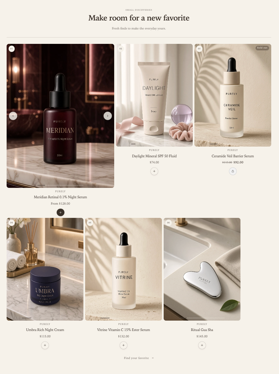
Choose Desktop layout → Editorial spotlight to give the first product a larger image area. The remaining products continue in rows below. This example shows six products, with the first product emphasized and two smaller cards beside it.
Grid
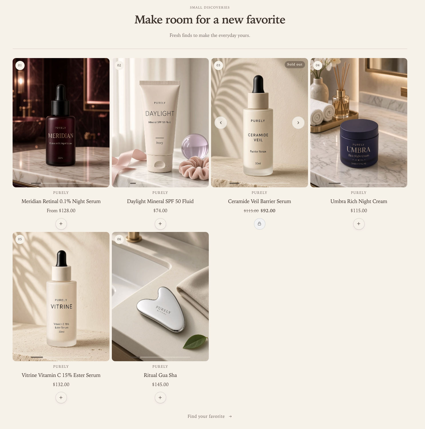
Choose Desktop layout → Grid for equal-width cards that wrap into rows. This example shows six products with Desktop columns → 4: four products in the first row and two in the second. Customers scroll down the page to see the remaining rows.
Product shelf: Quiet and Framed cards
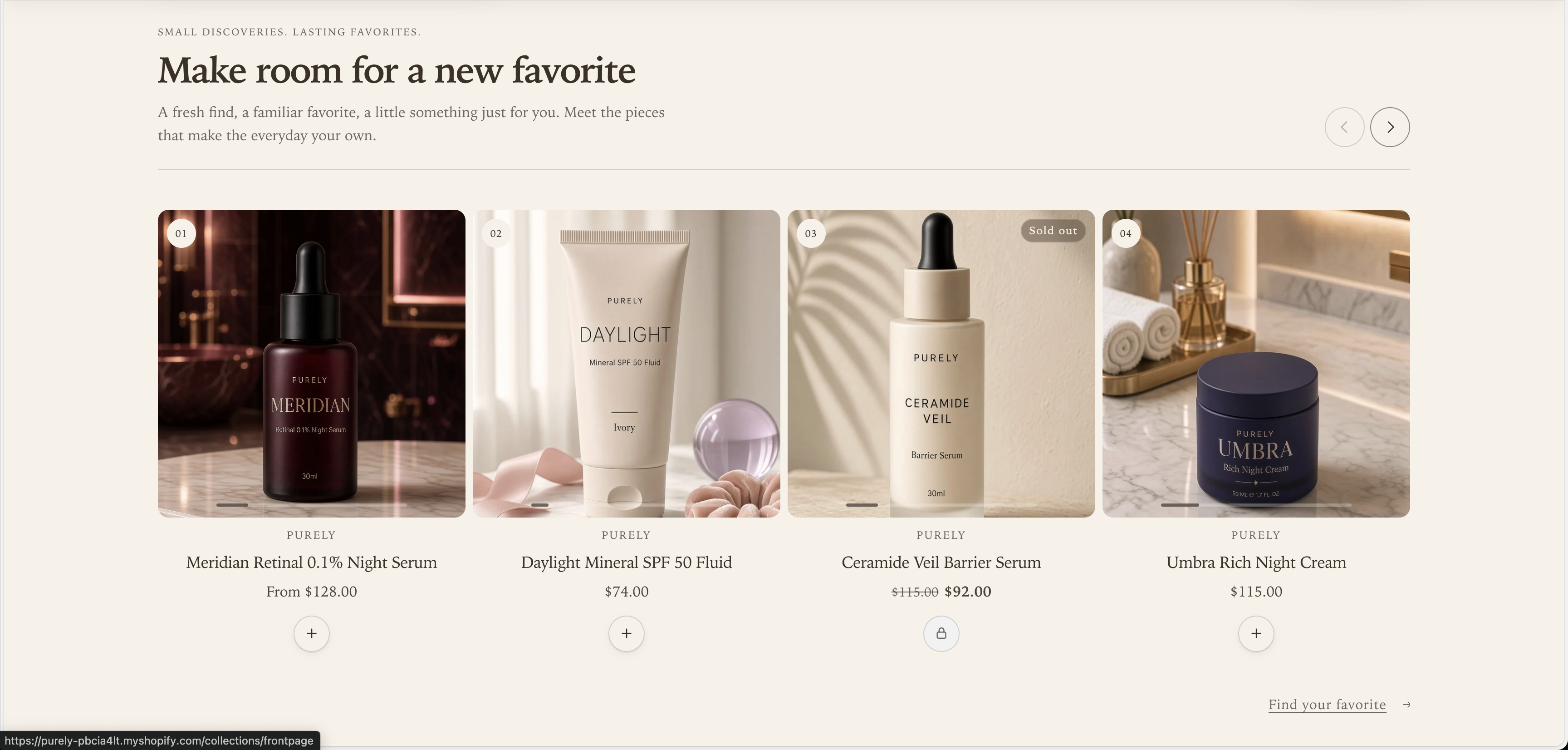
These desktop examples use Desktop layout → Product shelf with Desktop columns → 4. The arrows above the row browse the collection when more products are available.
With Card style → Quiet, the product image, information, and purchase action sit directly on the section background.
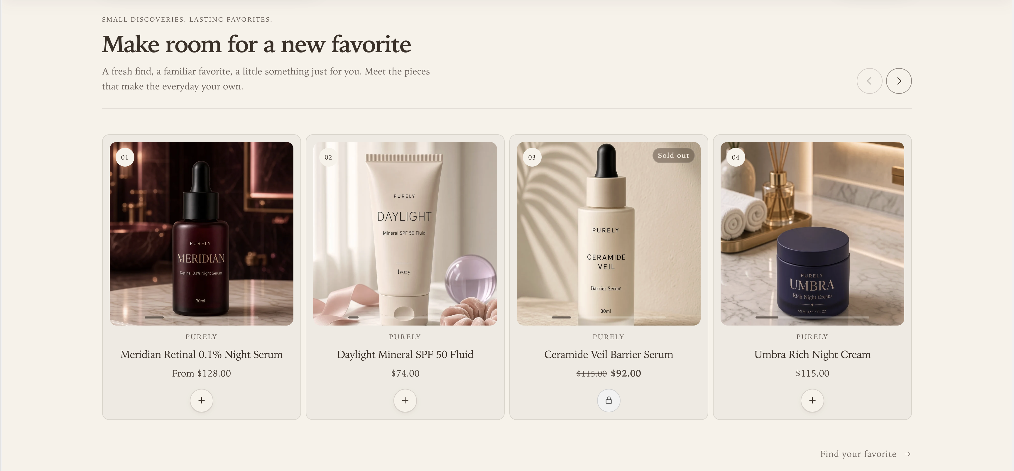
With Card style → Framed, a border and background enclose each product’s image, information, and purchase action. The collection and desktop layout stay the same; only the card treatment changes.
Set the phone layout separately
Below 750px, Mobile layout controls the arrangement regardless of the desktop choice:
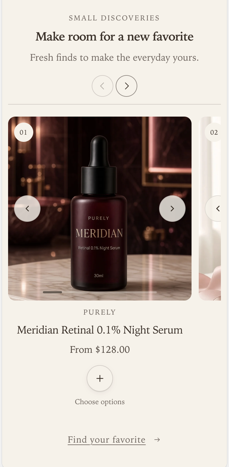
- Swipe creates a horizontal row with part of the next card visible to suggest more products.
- Grid wraps the cards into rows.
Mobile products per row offers One or Two for either layout. The editorial spotlight returns to the same card width as the other products on a phone. Start with one for larger product photography; use two for a denser selection and check that names and prices remain easy to read.
One product per row
Set Mobile layout → Swipe and Mobile products per row → One for a large card with a preview of the next product at the edge.
Two products per row
Keep Mobile layout → Swipe and choose Mobile products per row → Two to show two smaller cards and a preview of the next one. Both mobile examples show the purchase action and its Choose options caption beneath the price.
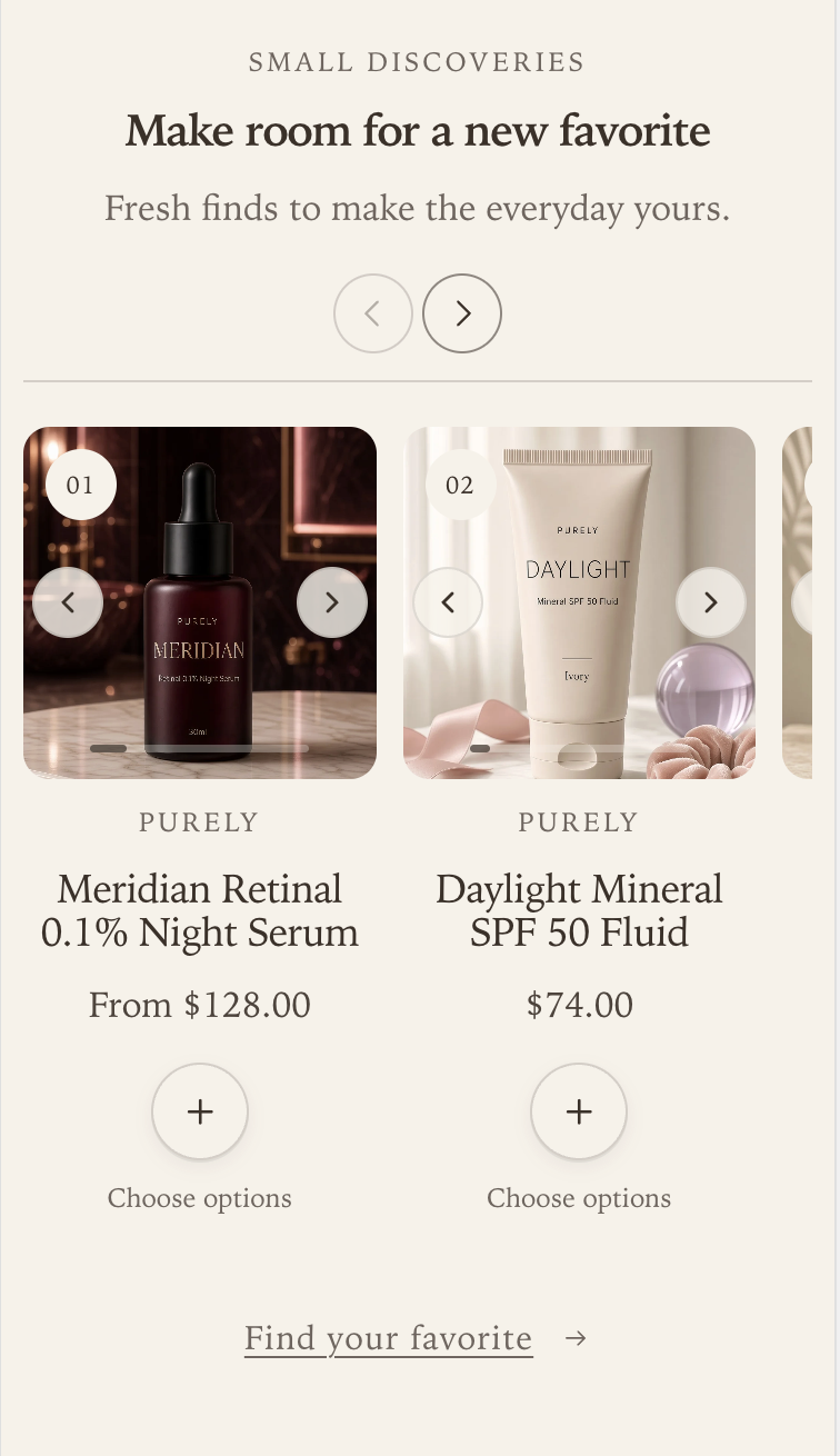
The arrows above the products move through the collection. The arrows over each product image browse that product’s media when Product cards → Product card image behavior → Slideshow is selected. Swiping the row browses products.
Understand quick add and quick view
Show quick add enables the purchase action on each card. What it does depends on the product:
| Product | Action |
|---|---|
| Available, with only the default variant and no required selling plan | Adds directly to the cart using the variant’s minimum quantity. |
| Available, with options or a required selling plan; quick view enabled | Choose options opens a compact popup with variant selectors, quantity, and Add to cart. |
| Available, with options or a required selling plan; quick view disabled | Links to the product page to choose options. |
| Unavailable | Shows a sold-out action that cannot purchase the product. |
Show quick view appears only when quick add is enabled. Turning off quick add removes both purchase actions and quick view; the product image and title still link to the product page. Configure the popup itself in the global Quick view theme settings.
Button visibility offers On card hover and Always visible. Hover mode also shows the action when keyboard focus enters the card. Actions remain visible on touch screens, so customers do not need to discover a hover interaction on a phone.
Know which settings are shared
This section controls Card style (Quiet or Framed), Show product numbers, and purchase actions. Heading size sets the section heading and supporting text only; product titles and prices use the global Product cards text size. Its Content alignment controls the section header.
Image ratio, image fit, media hover behavior, product information alignment, vendor, ratings, and badges come from global Product cards settings. Those settings also affect cards elsewhere in the store. The section has no separate image-ratio, vendor, rating, or spotlight-description controls.
Enable Show in featured collections under global Product cards settings. Configure the picker style and swatches under Product variants. Ratings require both the global rating setting and rating data supplied by a compatible reviews app; missing ratings stay hidden.
See Theme settings and the settings reference for the shared controls.
Collection copy and empty states
Clear Heading to use the collection title. Eyebrow text and Body text are optional; the body does not automatically pull in the collection description. Button label supplies the text link to the selected collection, and leaving it blank hides the link. Show collection product count displays the total number of products in the collection, even when this section shows fewer.
Without a selected collection, the section shows placeholder cards, capped at six. These are demo content, not products customers can purchase. A selected but empty collection shows an empty message instead. Check a populated collection, a product with options, and a sold-out product in the theme preview before publishing.
Section settings
Every setting on the section itself, in the order it appears in the theme editor. Group headings match the editor's own grouping.
Content
Uses the collection heading when left blank.
Leave blank to hide the collection link.
Layout
Product cards
On card hover also shows buttons on keyboard focus. Buttons remain visible on touch screens.
Opens a popup with variant options and add to cart for products with multiple variants.
Style
Also sets the supporting text size. Product cards use the text size from Product cards theme settings.
Fades the section in on scroll. Respects the theme animation setting and reduced motion.