Collection banner
An editorial collection introduction with text over an image, below an image, or beside it. Mobile composition and spacing are automatic.
- Merchant-addable
- Yes
- Settings
- 13
- Block types
- —
- File
sections/collection-banner.liquid
Used by default on: Collection, collection.concern
Desktop — 1440px
Mobile — 390px
When to use it
The top of every collection page.
Setting it up
- Add the section above the product grid. Title, description, and image come from the collection record in Shopify admin.
- Write an optional Eyebrow and choose whether to show the description and subcollections. Subcollection links come from each collection: its optional
custom.sub_collectionsmetafield, otherwise the collection links nested under it in the Subcollections menu (Main menu by default). - Enable Show collection image and choose Banner layout: Text over image, Text below image, or Split. Split reveals Image position.
- Choose Banner height and Crop from top. Text over image also offers Improve text readability, a background-color gradient that keeps overlay text readable over any photograph.
- Choose Collection heading size, Heading weight, and Color scheme. Regular is the default for a lighter title; Theme default follows the global heading weight. The theme handles alignment, spacing, mobile composition, and link sizing; motion follows global settings.
Where the content comes from
Shopify collection data owns title, description, and image. Section settings own the eyebrow, the subcollection menu, and layout. The menu supplies each collection's own links; an optional collection metafield overrides them per collection. Product counts belong in the product grid toolbar.
Notes and cautions
- All layouts place text below the photograph on phones. Without an image, the section becomes a compact text banner.
- Use a 3200 x 1200px JPG for Text over image and Text below image, with quiet space on the left for Text over image; use a 2400 x 1200px JPG for Split, which runs the photograph to the screen edge beneath an overlapping, bordered text panel.
- Compact uses 360px desktop imagery; Standard uses 480px. Match image ratio follows the upload. Long overlay copy can increase the height; phones show the original image ratio.
- Text below image places a short introduction and the subcollection links in a right column beside the title on desktop, links 16px below the introduction. Descriptions longer than 240 plain-text characters use a full row. Phone copy stacks; titles and descriptions are never truncated.
- Improve text readability holds a background-color gradient behind the text half of the image and shows overlay text at full strength, keeping it readable over any photograph. Turn it off only when every image has quiet space behind the text.
- Legacy background, below-image, and Classic/Arch/Square configurations migrate to overlay, below-image, and Split respectively. Separate surfaces, alignment, padding, and section motion controls have been removed.
Collection banner
The Collection banner introduces a collection with its native Shopify title, description, and image. Edit those fields in Products → Collections in Shopify admin. Section settings own the optional eyebrow, presentation, and which menu supplies subcollection links. An optional collection metafield can set one collection’s links instead; basic operation does not require a metafield. This section has no blocks. Product counts belong in the product grid toolbar.
Choose a layout
Banner layout replaces the separate style, desktop treatment, and mobile treatment controls.
| Layout | Desktop | Phone |
|---|---|---|
| Text over image | Left-aligned text directly over full-width photography, with a generous inset | Full photograph, then text |
| Text below image | Panoramic photography above an editorial title and introduction row | Full photograph, then text |
| Split | The photograph runs from inside the page grid to the screen edge, and the text sits in a solid, thinly bordered color-scheme panel with a soft shadow that overlaps its inner edge; choose Image position → Left or Right | Photograph above text |
Text over image is the default for new sections. Existing collection templates migrate to the closest layout: background overlays become Text over image, below-image treatments become Text below image, and Classic, Arch, or Square become Split. Panel and glass treatments become an overlay with the readability gradient. Tall height becomes Standard.
The theme automatically handles left alignment, vertical centering, spacing, link sizing, and mobile composition. There are no separate padding, chip size, text-only height, or section animation controls. Heading weight can be Regular (the default) or Theme default. Entrance motion follows the global motion and reveal settings; an opening banner renders its text immediately, and its photograph settles in from 10% over full size to rest, starting once the photograph has loaded so the whole movement is visible. It takes a slow four seconds whatever the Interface animation speed, which times controls rather than this entrance. The settle scales the image only, never fades it, so the photograph is fully visible from the first frame and page loading is not slowed. It is turned off with Reveal on scroll, by the None motion style, or by a visitor’s reduced motion preference.
These previews use Theme default heading weight. Choose Regular for the lighter title.
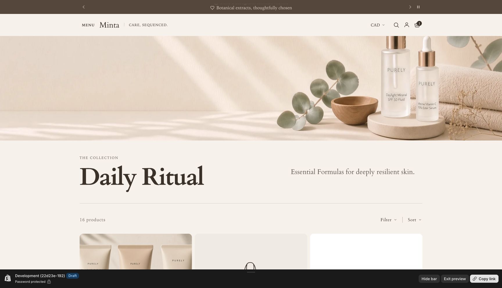
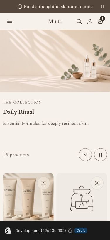
Set up the photograph
Turn on Show collection image. For Text over image and Text below image, use a 3200 x 1200px .jpg. For Split, which runs the photograph to the screen edge, use a 2400 x 1200px .jpg. Text over image needs quiet space on the left and the subject toward the right. Different collections can use different photographs with consistent lighting and palette.
Banner height offers Compact, Standard, and Match image ratio. Compact gives desktop imagery 360px of height; Standard gives it 480px. Match image ratio follows the original upload up to 80% of the screen height; a taller image is cropped to that height rather than pushing the products below a full screen of photograph. Text over image uses these as minimum heights, so long copy can expand the banner. Crop from top changes vertical framing whenever the photograph is cropped, including a tall image capped in Match image ratio. Phones show the original image ratio regardless of the desktop height; images taller than 4:5 show at 4:5 there and in Split. Text below image and Text over image use an edge-to-edge photograph; Split runs it to the screen edge on its own side.
Improve text readability appears only for Text over image. It is enabled by default and adds a gradient in the color scheme’s background color that holds steady across the half of the image behind the text, then fades out across the photograph. The eyebrow and description show at full text strength while it is on. Together these keep overlay text readable over any photograph in every shipped color scheme. Turn it off only when every collection image has quiet space behind the text; choose Text below image or Split when it does not.
With the image hidden or missing, a compact text banner appears naturally. It retains the title, optional description, and links without reserving an empty photograph area.
Adjust content and typography
Leave Eyebrow blank to hide it. Show collection description controls the native rich-text description. Short introductory copy is clearest. Long copy remains fully visible and expands the section. Blank paragraphs left by pasted copy are removed, including ones carrying attributes or wrapped spaces. Descriptions longer than 240 plain-text characters move to a full row automatically, so the photograph never stretches to fit long copy: in Text below image the row sits under the title, and in Split and Text over image it sits directly below the banner, on the same color scheme, aligned with the title above it. On desktop that row flows into two or three columns across the page width, so each line stays a comfortable 36 to 70 characters; images and headings never split across columns. Phones show one column. Titles wrap without truncation.
Images, HTML videos, and embedded video players in the collection description remain visible when Show collection description is enabled. They fit within the description column and follow Theme settings → Corner style: Soft rounds their corners, and Sharp keeps them square. Images and HTML videos retain their proportions; embedded players use a responsive 16:9 frame. Images uploaded to Shopify are served at the size their column needs, from 375px to 1500px wide, so a large original does not download in full on a phone. Images hosted elsewhere, SVGs, and GIFs are shown as uploaded.
In Text below image, a short introduction is set in the heading font and scales with Collection heading size: up to 18px at Small, 21px at Medium, and 24px at Large, sized to the available content width. Long descriptions and every phone layout use 15–16px body text.
Collection heading size offers Small, Medium (the default), and Large. Overlay, Split, and text-only banners use the shared editorial scale: 28–40px, 32–56px, and 36–72px on desktop. Text below image retains its masthead scale: Small 36–100px, Medium 42–130px, Large 48–160px, proportional to available content width. All layouts use 28px, 34px, and 40px on phones. The heading font family follows the global theme typography settings. Heading weight defaults to Regular (400) for a lighter collection title; when the theme heading font is heavier than regular, this loads one extra font file. Choose Theme default to follow the global heading weight. A heading font without a regular weight keeps the theme weight. This setting applies to the title in every layout and does not change other theme headings or the description. The Color scheme supplies the paired text and background colors. Check readability when using an image overlay.
Add subcollection navigation
Show subcollections is off by default; turn it on to add the row. Links are worked out for each collection, so every collection that shares a template shows its own row rather than the same list.
- Optional metafield. A collection’s
custom.sub_collectionsmetafield (type: list of collections;custom.subcollectionsalso works) sets that collection’s links in your chosen order. Use it when a collection’s links differ from your menu. - Subcollections menu. Otherwise, the banner reads the menu chosen in Subcollections menu (Main menu by default). It finds this collection in the menu, at any of its three levels, and shows the collection links nested under it, in menu order. A nested collection with nothing under it shows its siblings instead, with itself marked as the current page, so shoppers can move between neighboring subcollections. Product, page, and other non-collection links are skipped.
These are fallback sources, not combined lists: a filled metafield replaces the menu for that collection. Up to eight links appear. Shopify has no built-in collection hierarchy, so the menu you already maintain is the zero-setup source. Without valid links, no empty navigation appears on the storefront; in the theme editor, a note in its place explains how to add links or turn the setting off.
Links use compact chips with 32px minimum height on desktop and 36px on phones. Labels use 14px type on desktop and 15px on phones. In Text below image on desktop, the links sit in the right column, set flush right so it ends on the page edge opposite the title: 16px below a short introduction, alone when there is no description, or beside the title when a long description takes its own row. In Split and Text over image, and on every phone layout, navigation sits 16px directly below the title, before the description, however long the description is. Chips wrap on small screens and follow global button hover and focus styles. When the list includes the collection being viewed, its chip fills with the scheme’s text color and is announced to screen readers as the current page. The title remains the page’s H1. Headings inside the collection description are demoted from H1 to H2 so they do not compete with it.
Section settings
Every setting on the section itself, in the order it appears in the theme editor. Group headings match the editor's own grouping.
The title, description, and image come from the collection in Shopify admin. The product count appears in the product grid toolbar.
Content
Small text above the collection title. Leave blank to hide it.
Shows the native collection description. Descriptions over 240 characters use a full row: under the title in Text below image, and below the banner in Split and Text over image.
Lists subcollections as links: in the right column in Text below image on desktop, otherwise directly below the collection title. Links come from each collection, so collections sharing this template show their own.
Each collection shows the collections nested under it in this menu, in menu order, up to eight. A nested collection without its own shows its siblings. To set a list for one collection, use the optional custom.sub_collections metafield (list of collections), which takes priority.
Image
3200 x 1200px .jpg recommended for Text over image and Text below image; 2400 x 1200px .jpg for Split, which runs the image to the screen edge. For Text over image, leave quiet space on the left and place the subject on the right.
All layouts place text below the photograph on phones. Without a collection image, a compact text banner appears.
Compact keeps products close to the banner. Standard gives the photograph more space. Match image ratio follows the uploaded image up to 80% of the screen height. Long copy always expands the banner. Phones show the original image ratio, and images taller than 4:5 show at 4:5.
When the banner is shorter than the collection image, including a tall image capped by Match image ratio, this much of the cropped area comes off the top and the rest comes off the bottom. Use a higher value for photography that stages the product along the lower edge.
Adds a background-color gradient across the half of the image behind the text and shows overlay text at full strength. Turn off only when every collection image has quiet space behind the text.
Appearance
Theme default follows the global heading weight. Regular uses a lighter collection title and loads one extra font file when the theme heading font is not already regular weight. Both use the theme heading font.