Benefits and suitability
What the product does and who it is for, side by side: a numbered benefit path and a profile card of skin types, features, finish, and routine, beside an image you can shape and place. Both lists read Shopify category attributes per product, with blocks as the fallback.
- Merchant-addable
- Yes
- Settings
- 34
- Block types
- 2
- Max blocks
- 12
- File
sections/benefits-suitability.liquid
Used by default on: Product, Product (set)
When to use it
On product pages, directly below the buying section, for any product with a specific fit or contraindications.
Setting it up
- Add the section to a product template. It cannot go in the header or footer groups.
- Write the Eyebrow, Heading, and Body text under Content, choose a Heading size, and set Mobile header alignment to Left or Center.
- Leave Benefit source on Product data and pick the Benefit attribute. Products with that category attribute list their own benefits; Number of benefits caps how many show.
- Add Benefit blocks as the fallback for products without benefit data. They are the same on every product, so write benefits your whole range can claim.
- Add a Suitability detail block per profile row. With Suitability source on Product data, pick a category attribute under Value source so the row reads each product's data; rows the product has no data for hide. Choose Suitability blocks to show each row's typed Value on every product instead.
- Under Media, upload an Image — until you do, the product's image shows — or switch Image source to Product image. Then choose Image position, Image shape, and Image height.
- Set the Safety note, Color scheme, and padding last.
Where the content comes from
Shopify product data owns the benefits and profile values whenever the product has category attributes, and the product image when Image source is Product image. Blocks own the fallback benefits, each row's label and icon, and their order. Section settings own the heading, body text, note, and uploaded image. No custom metafield is required.
Notes and cautions
- Benefit source and Suitability source are separate. Switching benefits to blocks does not switch the profile rows.
- Suitability blocks show the same typed values on every product. A row reading "Dry · Normal · Combination" on a supplement is a false claim, so keep Product data unless the values are true of the whole template.
- Match content lets the image grow with the text beside it on desktop. Choose Portrait (4:5) or Square (1:1) for a fixed shape.
- Rectangle follows the corner style in theme settings; Arch, Capsule, and Oval are fixed shapes.
- State what the product is not for. It reduces returns more reliably than any amount of positive copy.
- Keep claims cosmetic, never medical. "Supports the skin barrier" is a claim you can make; "treats eczema" is one you cannot.
Set up the section for every product
Benefits and suitability answers two questions on a product page: what the product does, and who it is for. The numbered path on one side lists the benefits. The profile card beside it lists who the product suits: skin types, features, finish, routine.
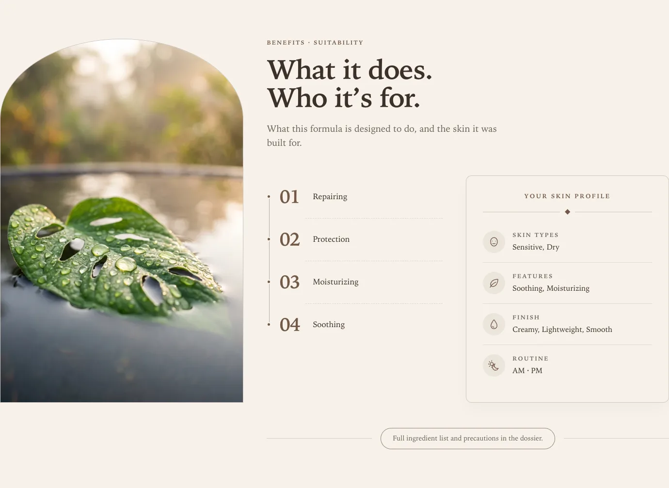
The section appears on every product that uses the template, so anything you type into it appears on every one of those products. The setup below keeps it true for each product.
Where the content comes from
The two lists each have their own source setting, and they are independent. Benefit source controls only the numbered benefits; Suitability source controls only the profile rows.
| Content | Product data | Blocks |
|---|---|---|
| Benefits | The Benefit attribute from the product, or the Benefit blocks when the product has none | The Benefit blocks |
| A profile row | The attribute chosen in the row’s Value source, or its Fallback value. A row set to Manual shows its Value | The row’s Value, or its Fallback value |
| Image | The image you upload, or the product’s featured image until you upload one |
Under Product data, a profile row never shows its typed Value in place of a missing attribute. That keeps “Dry · Normal · Combination” off products it was never written for. Switch Suitability source to Suitability blocks when you want the typed values on every product.
Category attributes come from Shopify. Assign a product category in your Shopify admin and Shopify adds fields such as Suitable for skin type and Skin care effect to the product. Fill those in and the section reads them without any setup. See Per-product content.
Keep the claims true
Typed text appears on every product. A profile row with “Dry · Normal · Combination” in Value tells a shopper that a gift card, a supplement, and a cleanser all suit dry skin.
- Leave Suitability source on Product data when your products have category attributes. A row then shows only on products that have its data, and hides everywhere else.
- Use Suitability blocks only when the typed values are true of every product on the template. Assign a separate product template to products that need different values.
- A Fallback value shows on every product without the data, so treat it like typed text.
- A newly added section arrives with four example rows — Skin types, Features, Finish, and Routine — whose fallback values keep the card filled while you set it up. Products with category data show their own values instead. Replace the fallbacks with wording true of your range, or clear them so rows hide on products without data.
- The same applies to Benefit blocks. They are used on every product that has no benefit data, so write benefits your whole range can claim, or fill in Skin care effect on each product.
The section hides itself from shoppers when it has nothing to show, so an empty profile card or benefit list never renders.
Arrange the image
All image settings sit under Media, and appear only while Show media is on.
| Setting | Options | What it does |
|---|---|---|
| Image source | Uploaded image, Product image | Uploaded image uses the same picture on every product, and shows the product’s image until you upload one |
| Mobile image | Optional upload | With Uploaded image, replaces it on phones, with its own focal point. Phones download only this file |
| Image position | Right (default), Left | Places the image on either side from 750px wide |
| Image position on mobile | Above the benefits (default), Below the content, Hidden | Where the image goes on phones. See below |
| Image shape | Arch, Capsule, Oval, Rectangle | Rectangle uses the corner style from theme settings |
| Image height | Match content, Portrait (4:5), Square (1:1) | See below |
| Image height on mobile | Same as desktop, Portrait (4:5), Square (1:1) (default), Landscape (4:3) | The image’s shape on phones. Anything but a portrait frame shows as a rectangle |
| Image fit | Cover, Contain | Contain shows the whole image with space around it |
Match content starts as a 4:5 portrait and grows taller to match the benefits and profile beside it on screens 990px and wider. Choose Portrait or Square to keep a fixed shape whatever the text length. Phones use Image height on mobile instead, which defaults to a square so the benefits start sooner. Same as desktop gives the 4:5 portrait for Match content and Portrait, or a square for Square (1:1). Arch, capsule, and oval are drawn for a tall frame, so a square or landscape image on a phone uses the rectangle shape instead.
Portrait and Square sit vertically centered on the text beside them, measured from the first line of the body text down to the note. The eyebrow and heading stay above as the title. When the image is the taller of the two, the text keeps its spacing and centers on the image instead.
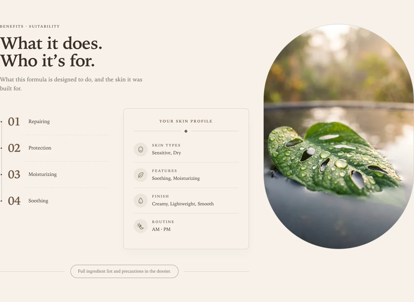
Cover crops the image to fill the shape. Set a focal point on the image in Shopify admin and the crop keeps the subject in view. The theme requests a large enough file for the crop, so a square or landscape photo in a tall frame stays sharp.
An uploaded image is treated as decoration. Give it alt text in Shopify admin only if it shows something a shopper needs to know about. A product image falls back to the product title.
On a phone
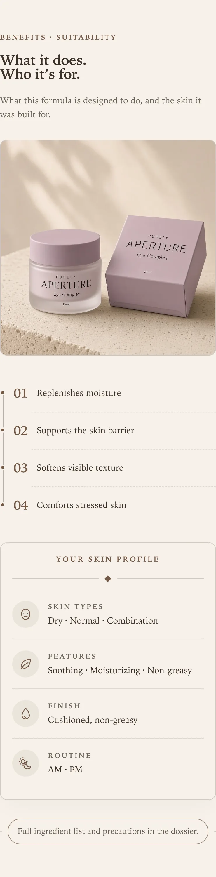
The section stacks in a single column: heading, image, benefits, profile, then the note. Image position on mobile moves the image: Below the content brings the benefits straight under the heading and closes the section with the image, after the note, and Hidden leaves it out on phones. A hidden image is not downloaded. Larger screens are unchanged. Mobile header alignment under Content sets the eyebrow, heading, and body text to Left or Center on screens below 750px. The benefits and profile card keep their own layout.
When something looks wrong
- A message in the theme editor says rows are hidden. It names the rows a shopper cannot see on the product you are previewing. Under Product data, the product lacks that row’s attribute; under Suitability blocks, the row has no Value. The message only appears in the editor.
- Benefit source is set to Benefit blocks, but profile rows still read product data. The two lists are set separately. Set Suitability source to Suitability blocks as well.
- Hiding a Benefit block changes nothing. Benefit source is Product data and this product has benefit data, so the blocks are not used. The theme editor says so under the list.
- A profile row is missing. See the editor message above the list for which rows and why.
- A row shows fewer values than the product has. Values shown caps a row so it stays on one line beside its icon. Raise it on the block.
- Image source is Uploaded image, but the product’s photo shows. No image has been selected yet, so the section shows the product’s image rather than an empty frame. The theme editor says so over the image. Select an Image under Media to replace it.
- The image looks stretched tall. Image height is Match content and the text beside it is long. Choose Portrait (4:5) instead.
- The whole section is missing. It has no benefits and no profile rows for this product.
Custom product metafields
The source controls also offer Custom product metafield. Enter the full identifier in
Metafield namespace and key, such as custom.routine_step, as plain text. See
Custom product metafield setup for the
creation steps, the control to use in this section, supported types, and fallback behavior.
An incomplete identifier displays a message in the theme editor.
Section settings
Every setting on the section itself, in the order it appears in the theme editor. Group headings match the editor's own grouping.
Content
Add at least one Benefit or Suitability detail block, or assign a product category so Shopify supplies the values. Customers see the section once it has content.
Add up to six Benefit blocks and six Suitability detail blocks.
Aligns the eyebrow, heading, and body text on screens below 750px.
Benefits
Applies to the numbered benefits. Product data uses the category attributes Shopify adds once you assign a product category, and uses Benefit blocks for products that have none.
Enter the full product metafield identifier as plain text, such as custom.when_to_use. Reads each relevant product, including cards with their own product. Supports text, numbers, true/false, and lists of text or numbers. Missing or unsupported values keep the existing manual fallback or empty state.
Caps the number of product values. Product data replaces Benefit blocks while you use that source.
Suitability
Applies to the suitability rows. Product data shows the attribute chosen in each row's Value source and hides rows the product has no data for. Suitability blocks show each row's Value on every product.
Leave blank to hide the note. Use only instructions that apply to the product.
Media
Applies outside a product page. On product pages, the current product supplies the image.
4:5 aspect ratio recommended. The product image shows until you upload one.
Optional. Replaces the uploaded image on phones. Uses the uploaded image when left empty.
Applies on screens 750px and wider. Image position on mobile places it on phones.
Below the content brings the benefits up under the heading on phones and closes the section with the image. Larger screens keep their layout.
Rectangle follows the corner style in theme settings.
Match content starts as a 4:5 portrait and grows taller with the text beside it on screens 990px and wider. Portrait and Square keep their shape and center beside the text.
Style
Spacing
Blocks
Blocks are added, reordered, duplicated, and removed inside the section. Each type has its own settings.
Benefit benefit max 6
Suitability detail profile max 6
Reads this attribute from the product. Shopify adds these once you assign a product category, so you do not need to set up metafields.
Enter the full product metafield identifier as plain text, such as custom.when_to_use. Reads each relevant product, including cards with their own product. Supports text, numbers, true/false, and lists of text or numbers. Missing or unsupported values keep the existing manual fallback or empty state.
A row stays one line beside its icon, so the attribute shows up to this many values.
Appears when Suitability source is Suitability blocks, or when Value source is Manual. Type text, or connect a dynamic source to read a metafield per product.
Appears when the row finds nothing else: the product lacks the attribute, or a connected dynamic source is empty. Leave blank to hide the row instead.